Our Tools
Goretti Publications utilizes only free and open source software (FOSS) for our products. This provides a great deal of benefit. Many people, though, don't understand what FOSS is, so a few words of explanation may be warranted.
FOSS is free not because it doesn't cost anything (though it usually doesn't), but because it's not controlled by anyone. That is to say, anyone in the world can take it and use it however they will, the only restriction being that they don't restrict anyone else's use of it. (Some FOSS software doesn't even require that.) It can be copied, changed, redistributed, repackaged, reused, rebuilt; anything. FOSS is open source because the source code—the computer language that makes the computer do what we want it to—is freely available for anyone to look at and change if they wish.
So how does using FOSS benefit you? Simple: it ensures that you get a higher quality product for less money. The fact that the software is free means that one rarely has to pay for it, and when one does one must pay much less than the typical fees for proprietary software; these savings are passed on to you in the form of lower prices. The fact that the software is open source means that I can change it and make it work better for the purposes I require; that means you're getting a higher quality product.
Typesetting Tools
For typsetting, Goretti Publications relies on the superlative TeX typesetting system designed by Donald E. Knuth, along with the LaTeX macro package designed by Leslie Lamport. These powerful programs do professional-quality typsetting, so long as there is a skilled hand at the helm—a hand that Goretti Publications can offer.
TeX (pronounced "tech") offers strong typesetting power with the attention to detail that proprietary programs all too often lack. It allows for complete ligatures, for example, put together automatically; these are true ligatures, single glyphs incorporated in the fonts, and not faked ones created by simply cramming the characters together. A few of the most common ligatures are shown below, with their non-ligatured counterparts displayed below them:

It doesn't take much to see the substantial quality improvement here. While these may seem like small details, it is the small details which make the difference between an average document and a beautiful one. This is only one example.
In a related matter, TeX also utilizes fonts designed for particular sizes, scaling fonts only when necessary and even then only from the design size closest to the desired scaled size. In other words, when typesetting a document in ten point font, TeX will use a font designed for ten point display, not a generically-designed font simply scaled to ten points. This does, in fact, make a big difference; the image below shows two lines containing both designed type sizes and scaled ones, which clearly illustrates the decline in quality due to scaling:

When fonts are scaled up, they tend to get overly wide, and the spacing gets bad; fonts designed for a given size remain compact but readable, and the spacing is appropriate for the point size.
A similar problem is that of "small caps," capital letters designed to be displayed at lower-case sizes. Small caps are commonly used for headings and for common all-capital abbreviations, where too much full-sized capital lettering would unduly stand out on the page. Many typesetting systems fake their small caps by simply scaling normal-sized capital letters down; most fonts designed for TeX, however, have real small caps, designed to be displayed as small capitals at a given size. The difference may seem academic, but in print it is very real:

Again, a small detail; but one of the many small details of typesetting and print design which makes the difference between acceptable and beautiful.
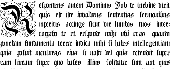
TeX allows a huge variety of decorative capabilities, as well. One of the most popular is the dropped capital:

This can be done with any font, with a great variety of dropped initials, even simply enlarged normal letters. This sort of technique provides a beautiful way to embellish a text without obscuring the message.
TeX also offers what is undisputedly the best hyphenation algorithm available. While most typesetting systems consider only a given line when determining hyphenation, expanding or shrinking spacing and hyphenating words according to how that particular line appears, TeX takes a much more holistic approach. It considers an entire paragraph at a time, taking into account many variables, many of which even high-priced proprietary offerings ignore. TeX considers that multiple hyphenations in a row generally look bad; that loose lines should not appear near tight lines; that spacing can be stretched more after punctuation than after letters; and many other factors. It is not uncommon for changing a letter or two near the end of a paragraph to change the spacing or hyphenation near its beginning, because the changed total length of the paragraph leads to a better all-around line-breaking solution for that paragraph. And most importantly, TeX acknowledges that even though it is the best available, it's still not perfect; there are ways to easily change its behavior to produce better results where the computer simply cannot see things the way a human typesetter can.
Fonts
Goretti Publications can employ a large number of fonts for your project, including custom-designed ones, if necessary. Below, you can find a sampling of the fonts available for your use. Because this is a web image, it won't scale well; if you want a closer look, you can download a pdf.

We can, of course, use virtually any font you desire; this is only a sampling. Whatever the project, Goretti Publications has the resources to do it right.
Graphics Tools
The graphics tools we use vary based on the type of graphic you need. Some graphics are very simple, some are complex; some are based on preexisting images, some are new; some are intended for display by themselves, some as part of larger text; and so on.
Metapost is a superb, elegantly designed language for producing graphics according to a mathematical description. The language itself is nearly identical to that of Donald E. Knuth's Metafont language, released along with TeX for the production of TeX-compatible fonts. (TeX is now able to work with many different font formats, produced by many different tools.) It produces Postscript output, which can (if necessary) be converted to other formats; its Postscript output is so good that it can be used without change by pdftex, while most other Postscript cannot. It is ideal for production of graphics according to mathematical descriptions, such as simple line graphics; graphs; and similar constructions.
Image Magick is a set of programs suitable for the manipulation of preexisting graphics. (It can be used to produce new graphics, but this is not its strongest suit.) Image Magick operates from the command line, and as such it is scriptable and easily used for applying the same manipulations to large numbers of images. For example, if we decide to apply a drop-shadow to every image included in a document, Image Magick can do this in an instant, whereas most graphical programs would require each image being opened, modified by hand, and then closed again. Image Magick's uses are varied beyond belief; as such, it's a powerful tool in our box.
The GIMP (the GNU Image Manipulation Program) is our tool for dealing with raster graphics; that is, graphics internally described in terms of pixels. This includes most web-type graphics, such as gifs and pngs, as well as the graphics produced by most digital cameras, typically jpgs. Mostly, our work with the GIMP will be limited to digital camera output. This powerful program's capabilities are too extensive to be described here; suffice it to say that it is more than adequate to handle your graphics needs.
Inkscape is our program of choice for vector graphics; that is, graphics which are described internally in terms of vectors rather than pixels. These graphics are always rasterized (converted into pixels) prior to being viewed; however, they are described internally not by pixels, but by vectors, which allows them to be scaled arbitrarily prior to rasterization. This usually leads to clearer images at many different scales. While Inkscape is for that reason not particularly amenable for photo editing (the GIMP is our tool for that), Inkscape is a valuable tool for producing other forms of graphics which need to be arbitrarily scaled but are not given to mathematical construction (for which we'd use Metapost).
